Project / Code
Drawing with the Fourier series
Hand a picture to a code that turn it into boarders, then a Fourier transform, throw away most of what comes back, and it draws the picture again — looser, rounder, and made entirely of circles going around circles.
That was generated from a photograph of me. What you are watching is seven closed curves, each one drawn by a chain of circles rotating on the ends of other circles, with one number deciding how many circles get a say.
Turn that number down far enough and every shape shrinks to a dot. Turn it up and the face snaps on — brow, eye and lip all crossing their threshold within a few frames of one another. In between there is a long stretch where the head has a shape but no identity, which is the part I find hard to stop watching.
Why a picture is a signal
A Fourier series is usually something you do to a signal: a voltage against time, a pressure against time. Anything that repeats gets written as a sum of sines and cosines, and the ones you keep decide how much detail survives. A closed curve — the outline of a letter, a face, a leaf — also repeats. Walk around it and you come back to where you started, so it is a periodic signal too, just one that happens to live in a plane instead of on a graph.
That is the whole trick. Walk the outline, list the points in order, and write each one as a complex number, z = x + iy. Now the outline is an ordinary one-dimensional periodic signal, and the FFT will happily eat it. Every coefficient that comes back is a circle: an amplitude, a frequency, and a starting phase. Ride the first circle, mount a smaller circle on its rim, mount a smaller one on that, and the pen at the end of the chain traces the original outline. Epicycles — the same machinery Ptolemy used to push planets across the sky, doing honest work at last.
Keep every circle and the outline comes back exactly. Keep only the slow ones and you get a sketch: corners round off, wobbles smooth out, and the shape relaxes toward the few gestures that carry it.
The code is yours to take. Both implementations — the original MATLAB script and a Python port that needs no license — live in one repository, along with the generated sample image and the tests, under an MIT license. Point it at any image of your own and it will draw that instead.
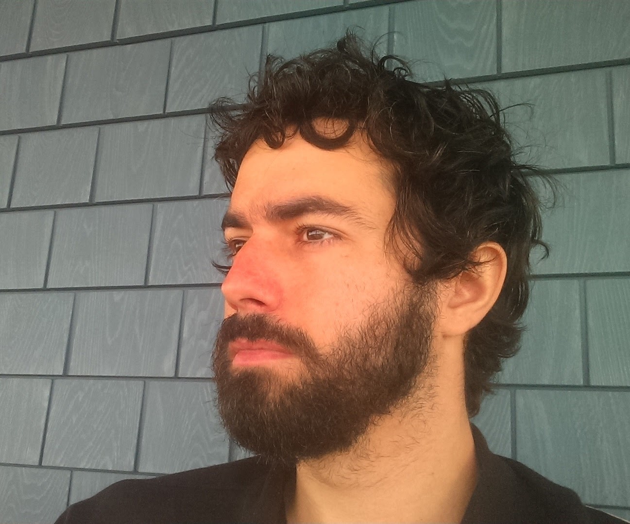
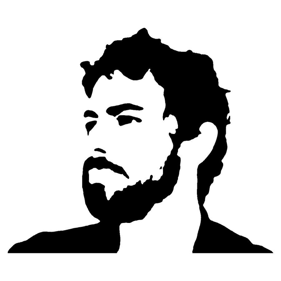
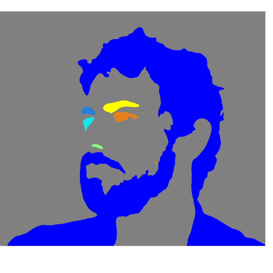
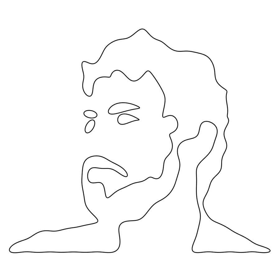
One run of the script, at the settings it currently holds. Every panel is a figure it puts on screen along the way.
Here is where those seven curves come from. Blur the photograph, threshold it, and it collapses into ink and paper — the second panel is what the code actually works on, and everything the drawing will ever know is already in it. Tint each connected region and you can count what survived: one enormous object, hair through beard through shoulders all joined into a single blob, plus six small ones — two brow strokes, the eye, a fleck of nostril, a lip, and a shadow beside the ear. Seven objects, seven closed outlines, and the last panel is those outlines rebuilt from a fiftieth of their Fourier coefficients.
The thing worth staring at is the gap between the second panel and the fourth. The mask is a solid black silhouette; the drawing is a thin continuous line. Nothing traced the edge by hand — the outline is simply where the mask stops, and once that boundary is a list of points in order it is a signal like any other.
Getting from a picture to a curve
Before anything can be transformed there has to be a curve to transform, and a photograph is not a curve — it is a grid of brightnesses. Four steps stand between the two.
First, throw away the detail. A photograph of a face is nearly all texture: individual hairs, pores, the weave of a shirt. Threshold it as it stands and the result is confetti — tens of thousands of specks, each of which the tracer will dutifully walk around. A heavy Gaussian blur ahead of everything else erases the texture and leaves the masses, and the masses are what a drawing is made of. Line art wants the opposite treatment, and gets it: blur a thin stroke and it disappears entirely.
Second, decide what counts as ink. Grayscale, then adaptive histogram equalization, which stretches the contrast tile by tile so a shadowed jaw is treated as generously as a lit forehead. Otsu's method picks the threshold that best separates dark from light, and what comes out is black and white with nothing in between.
Third, sweep up what survived. Islands of ink below a set fraction of the image area are erased, holes that small are filled, and a one-pixel open-then-close shaves the fuzz off what is left. Doing this on the mask rather than later on the list of outlines matters more than it sounds: a ragged speck in hair can carry an enormous perimeter around almost no area, so it strolls straight through a filter that only counts boundary points. Area is the honest measure of dust. Cleaning the mask is also what lets the minimum outline length stay low — roughly ten points instead of a thousand — so real detail survives while the junk does not.
Fourth, walk the edges. A boundary tracer follows the perimeter of every surviving blob — and every hole inside one, so the counter of an e, or the gap between beard and lip, becomes its own closed curve. Seven of them clear the length threshold on the photograph above; the rest of the picture is gone by this point.
Then the bookkeeping. The tracer hands back points already in walking order, so all that remains is dropping the repeated closing point and fixing the direction of travel. Blobs and holes come back wound opposite ways round, and the signed area of the polygon says which is which — one line of arithmetic that flips half the curves so they all run the same way.
Then the packing step, and the outline becomes a signal.
C = Xout + sqrt(-1).*Yout;          % the outline is now a signal
Ctransform = fftshift(fft(C));      % ... and these are its epicycles
The knob
Truncating means keeping a band of coefficients centered on the zero-frequency bin and zeroing everything outside it. Wide band, faithful drawing. Narrow band, loose drawing. The accuracy setting is simply the fraction of the spectrum that band spans, and pushed all the way down it keeps a single coefficient — the zero-frequency one, which is the average of every point on the outline, otherwise known as its centroid. One circle of zero radius: the shape reduced to a dot in the right place.
That explains the order of arrival in the clip at the top. The first coefficients carry gross position and mass, so the head has a shape long before it is anybody, and the small features are missing entirely — a short outline needs proportionally more of its spectrum before it is anything but a dot sitting at its own centroid. The sweep is spaced logarithmically because everything worth seeing happens below a tenth; above that the changes are cosmetic, a few stray hairs sharpening at the crown.
Watch where the shapes go on the way back down, though. Each one shrinks onto its own centroid and stays there instead of sliding off toward the corner of the frame. That it does so is the whole subject of the next section.
The bug that hides at full accuracy
Shifting a spectrum so the zero-frequency bin sits in the middle of the array does not put it at the middle of the array — not quite. For an even number of points it lands one place below the rounded midpoint, and the original MATLAB centered the band on the rounded midpoint. So the kept band sat one bin off, lopsided about the true center.
At full accuracy nothing happens. The band covers the whole spectrum either way, the drawing is perfect, and the code looks right. Turn the knob down and the band narrows around the wrong bin, and at its narrowest it keeps a neighbor instead of the zero-frequency bin — which is to say it throws away the average position of the outline. Every object, having lost the only coefficient that knew where it was, flies to the origin and collapses into a small circle. A drawing that dissolves into a pile of rings stacked in the corner of the plot is a strange thing to debug, because the symptom shows up nowhere near the arithmetic that caused it.
The fix is one line in each language. The guard against it coming back is a pair of tests: one that pins down where the zero-frequency bin actually is, and one that drives the accuracy to almost nothing and checks that each curve still sits on its own centroid. Both were run against a deliberately re-broken copy of the code, because a test that has never failed has not been tested.
Twice, in two languages
The original is a MATLAB script, and MATLAB is where this kind of thing is comfortable — the Image Processing Toolbox supplies the equalization, the threshold and the boundary tracer, so the interesting part is a dozen lines long. The Python port does the same work with scikit-image and numpy, and runs on a laptop with no license.
Porting it is also how the two implementations get to check each other. On the same image with the same settings the two binary masks agree on 99.993% of pixels — thirteen differ out of 193,600 — and both find the same fourteen outlines above the size threshold. Python's tracer returns more points per outline, since marching squares places a vertex wherever the contour crosses a pixel edge while MATLAB's tracer steps from pixel center to pixel center, but the drawn result is the same. Binarization is the step where any remaining disagreement will surface, since the two equalization routines share a tiling and a clip limit but not their internals.
Indexing is the trap when reading the two side by side. MATLAB counts from one and parks the zero-frequency bin at floor(N/2)+1; numpy counts from zero and parks it at N//2. Same bin, different address — and mixing them up is exactly the bug above.
Line art and photographs want opposite things
A clean drawing and a photograph of a face are not the same problem, and the settings that suit one destroy the other. Line art is already outlines: it wants no blur at all, no morphological smoothing — a smoothing disk bigger than about a pixel eats a thin stroke outright, taking the drawing with it — and a long minimum outline length, because every real stroke is long. A photograph wants the reverse: blur hard enough to erase texture, clean the mask aggressively, and then let short outlines through, because after that cleanup a short outline is a real feature rather than a speck.
Rather than rediscover that every time, the two live in the code as named presets, lineart and photo, one line to switch between them and every individual value still there to override. The panels above are photo, straight out of the script.
Cleanup also has a limit that is worth knowing before you go looking for it. Adaptive equalization stretches the tonal range of each tile on its own, so a tile sitting entirely inside a solid fill has almost no range to stretch — equalize it and you amplify quantization noise until the threshold lands on nonsense. The blurred background behind my head is exactly that kind of region, which is why it contributes nothing to the drawing.
Run it
pip install -r python/requirements.txt
python python/drawing_with_fft.py sample.png --accuracy 0.3 -o out.png
python python/drawing_with_fft.py face.jpg --preset photo --accuracy 0.02 -o face.pngFileIn at an image, pick a Preset, and run DrawingPlay.m.Everything above is at github.com/cjcrowley/DrawingWithFFT — DrawingPlay.m for MATLAB, python/drawing_with_fft.py for Python, the script that generates the sample, and the tests that keep the zero-frequency bin honest.